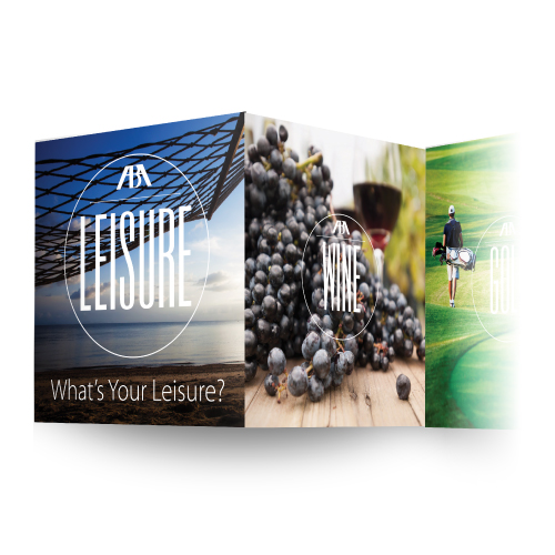
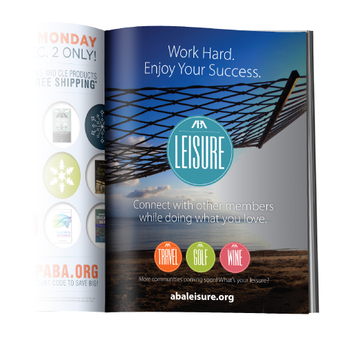
Challenge:
New ABA initiative, ABA Leisure, needed an identity and marketing collateral that was distinct from the standard ABA brand, promoting networking and leisure aspects separate, but necessary, to legal professionals.
Solutions:
Results:
Contributions:
Logo design, image sourcing, layout of all print collateral and project management.
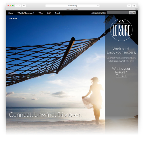
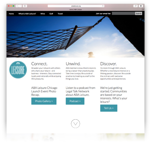
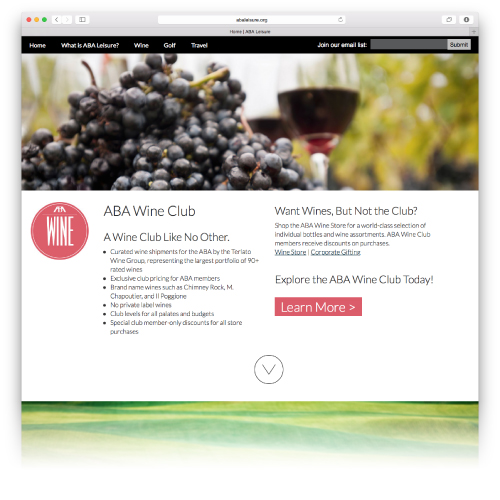
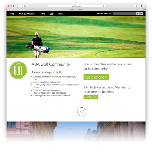
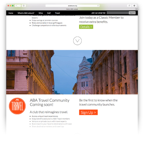
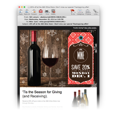
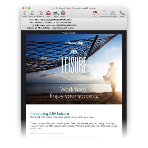
Challenge:
ABA Leisure needed a digital portfolio, including a pre-launch website, website, email template and video.
Solutions:
Results:
Contributions:
web design (pre-launch site), art direction and design consulting (full website), videography, email design.
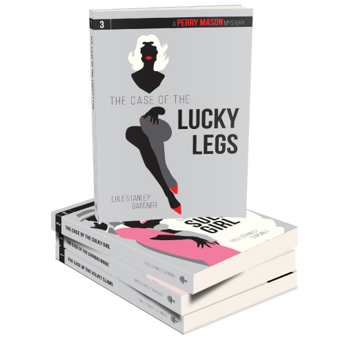
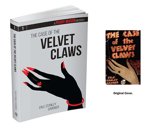
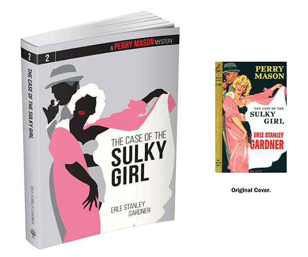
Challenge:
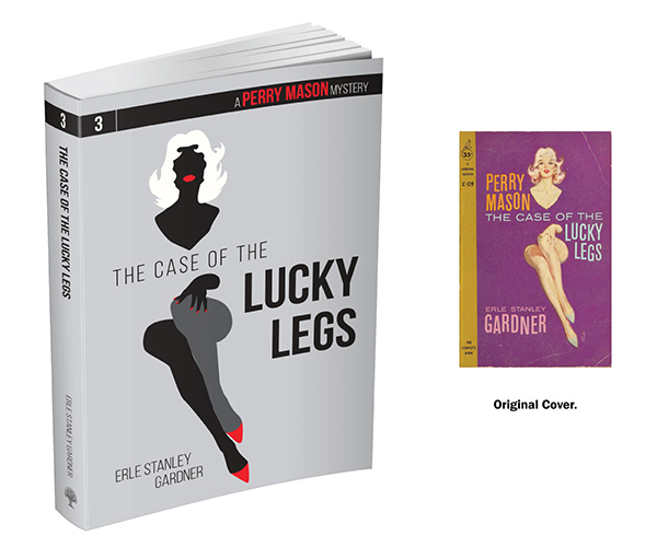
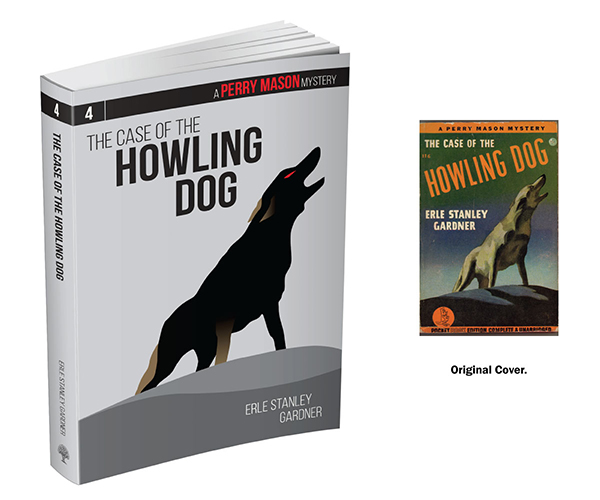
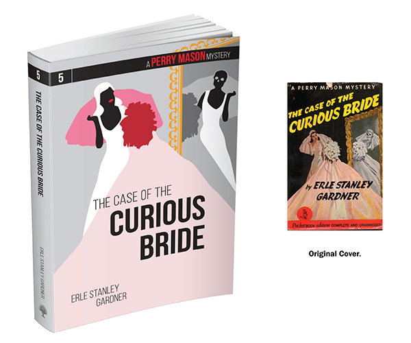
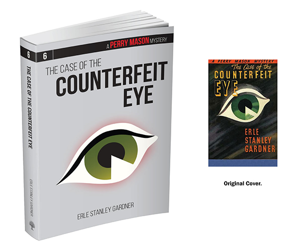
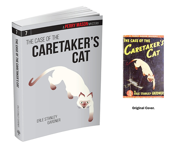
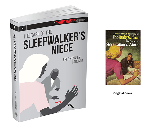
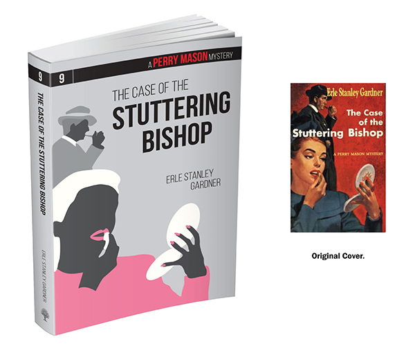
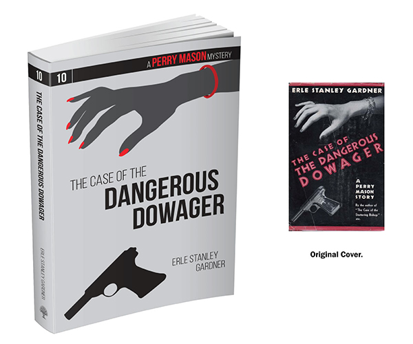
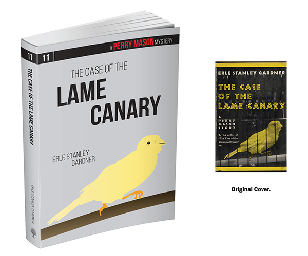
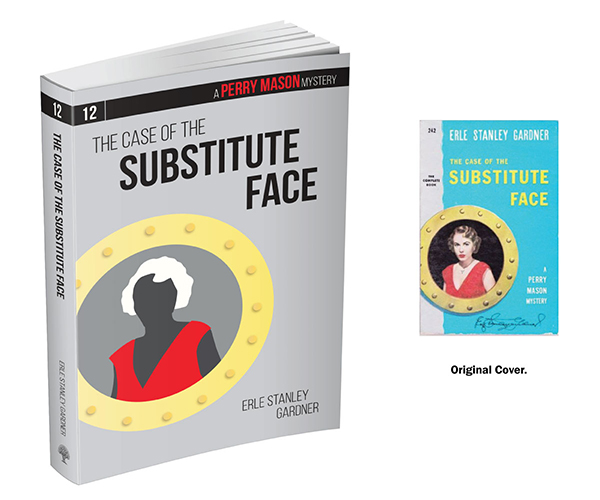
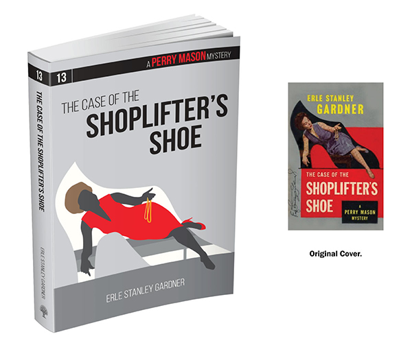
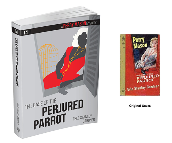
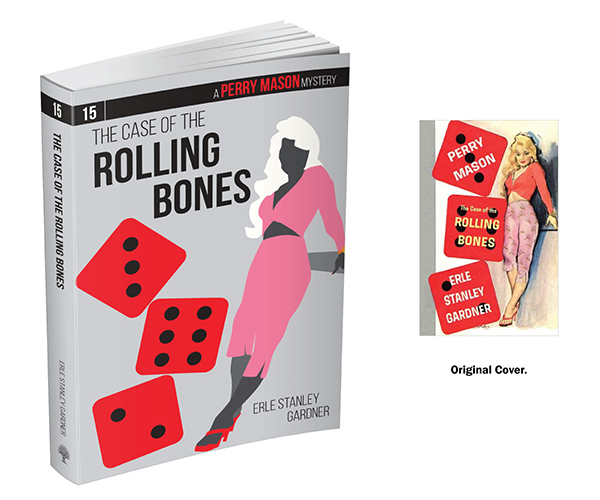
Ankerwycke, ABA’s new publishing imprint, acquired the print rights to the Perry Mason book catalog and set out to rebrand and relaunch the series. Requirements included that each book have a numbered banner and the series be cohesive in style and color.
Solutions:
Results:
The first 5 books sold out on release, prompting new print runs. Further titles are currently being released.
Contributions:
Brand identity, design of 15 book covers.
Challenge:
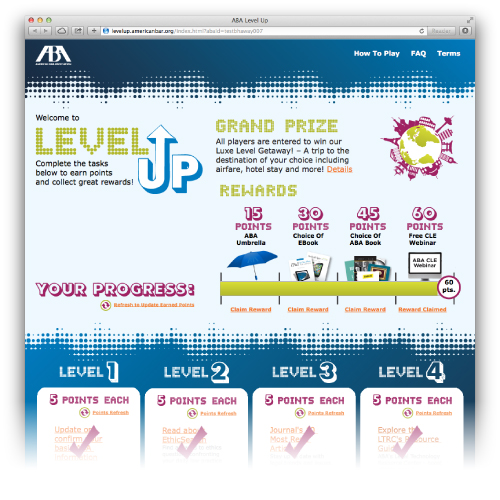
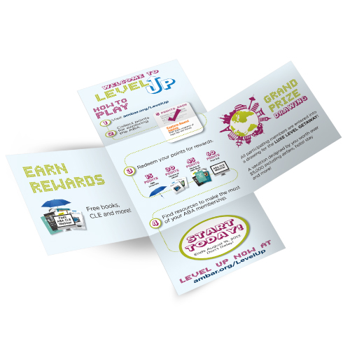
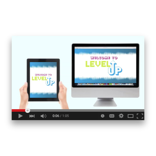
The American Bar Association wanted a game developed to engage mostly younger, disengaged members to interact with the ABA’s offerings while collecting user information to more accurately target member outreach.
Solutions:
Results:
Contributions:
Brand identity, microsite design, video storyboard with creative elements, “iron cross” style direct mail design.
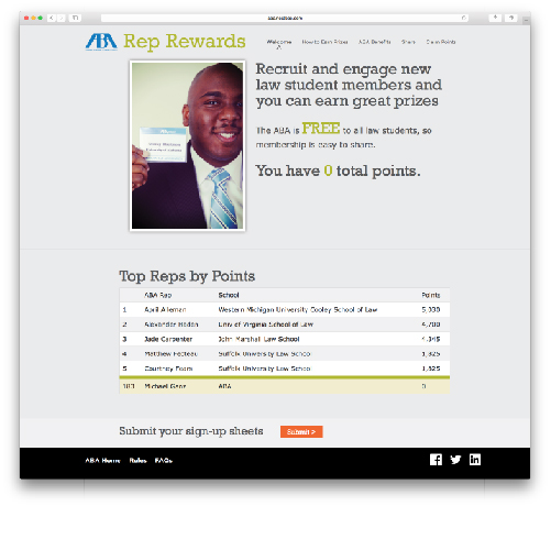
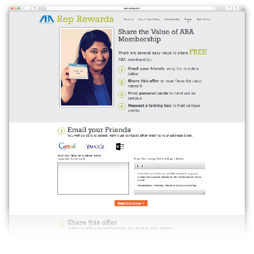
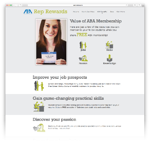
Challenge:
When American Bar Association Student membership was made free in the 2015-2016 membership year, marketing needed a microsite designed to entice current student members to recruit new student members. Requirements included the usage of real ABA member images and responsive design.
Solutions:
Results:
Pending: Campaign will run through the 2015-2016 membership year.
Contributions:
Wireframe design, website design, image enhancement.
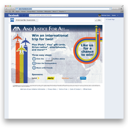
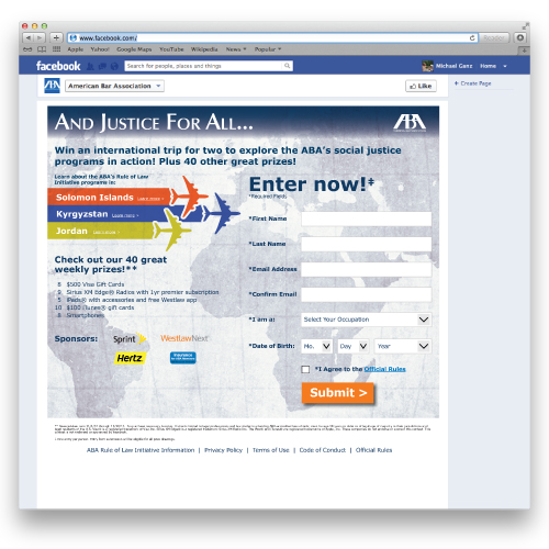
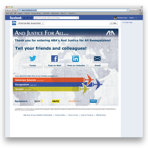
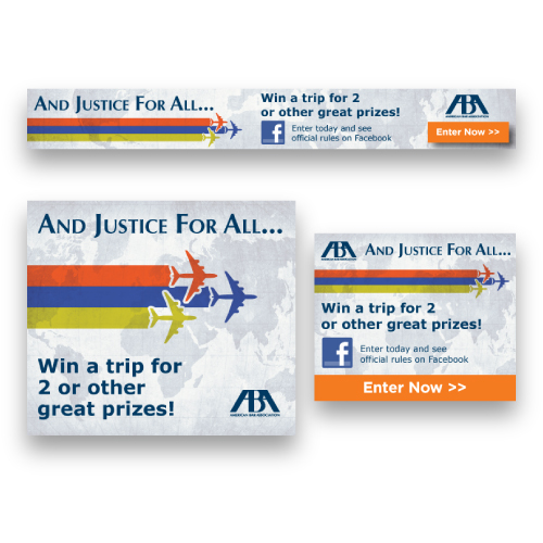
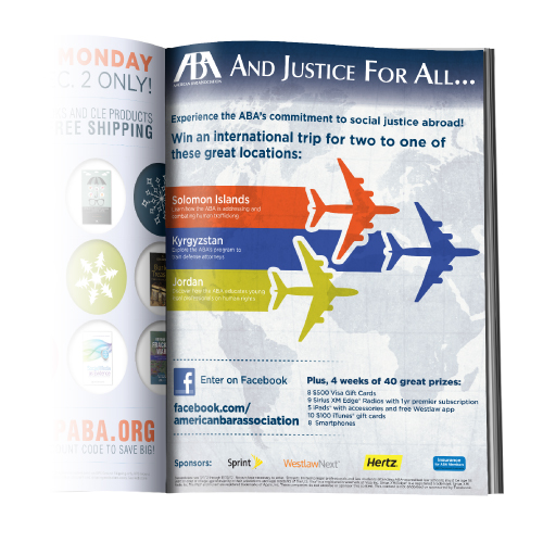
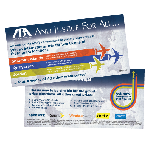
Challenge:
The American Bar Association wanted to increase awareness of, and interaction with, their Facebook presence among their members by generating "likes" through a travel-themed, prize-based contest.
Solutions:
Results:
Contributions:
Contest design/layout, print advertisement, print and direct mail collateral (billing buckslips, stickers, postcards, etc.).
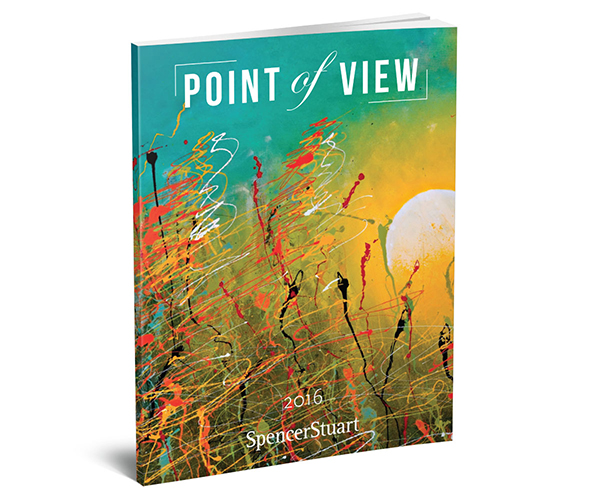
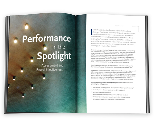
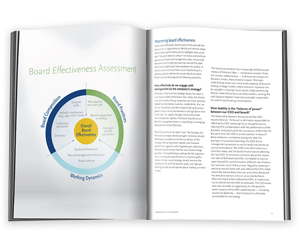
Challenge:
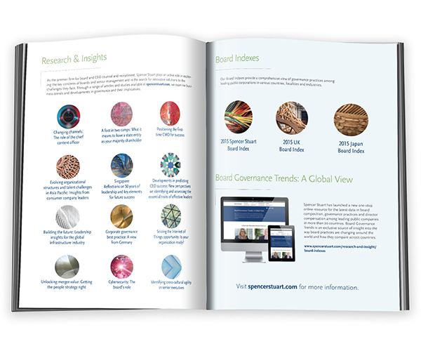
Spencer Stuart's flagship publication, Point of View, is used by consultants to drive new client business and stay at top of mind for current and past clients. Past issues were not consistent year to year, and looked somewhat dated and rushed. A refresh with a new masthead and more editorial interior layout was needed to heighten the brand.
Solutions:
Results:
Positive response from consultants and clients.
Contributions:
Masthead design, Cover and Interior image sourcing, Interior layout and styles.
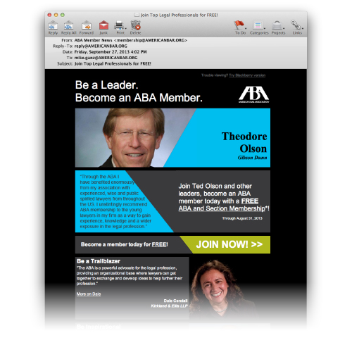
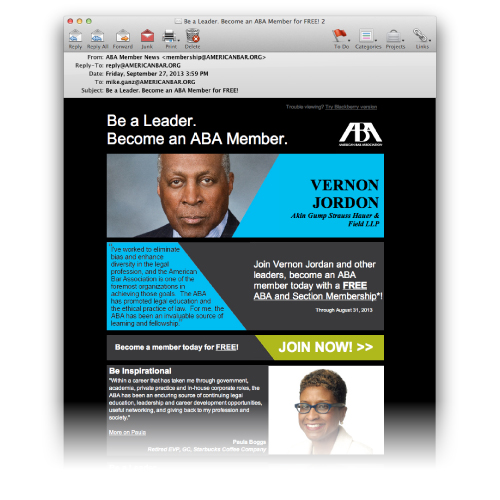
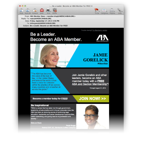
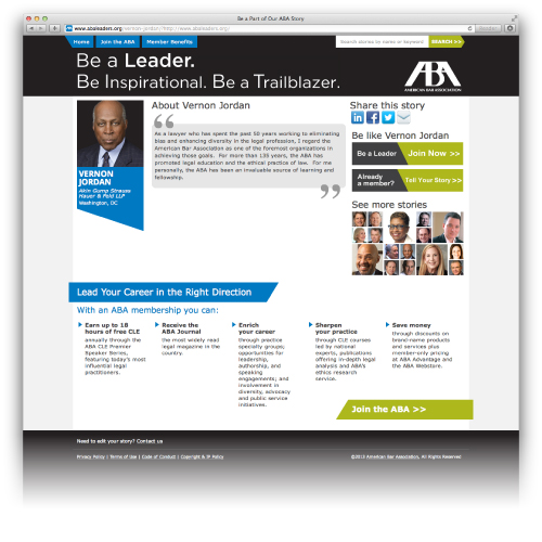
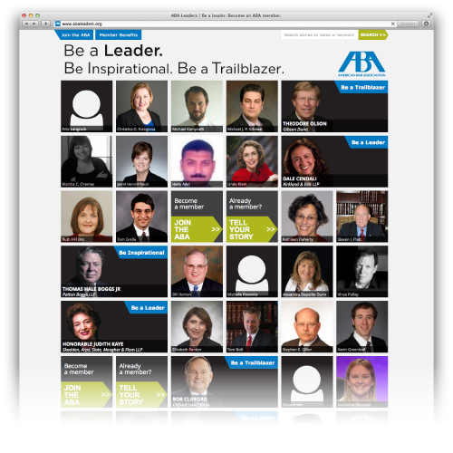
Challenge:
The American Bar Association wanted to leverage their more high-profile lawyer members by sharing their positive experiences with the ABA to A) increase retention among current members by inspiring them to share their own stories and interact with the ABA, and B) using those examples as a platform to recruit new members.
Solutions:
Results:
Contributions:
Aesthetic Look/feel, email layout, art direction.
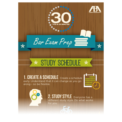
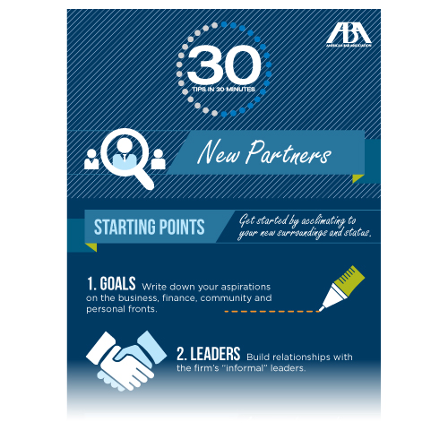
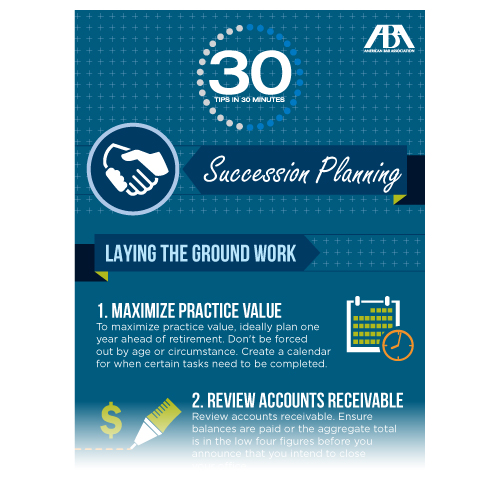
Challenge:
The ABA "30 Tips in 30 Minutes" advice series needed an infographic-style approach to keep readers engaged through each long list of tips. Requirements included having consistent typography and layout through the whole series, but a unique color scheme and design element for each separate infographic.
Solutions:
Results:
Member engagement went up, especially among student members whom benefited most from test and first-year tip lists.
Contributions:
Icon design, pattern creation, layout.
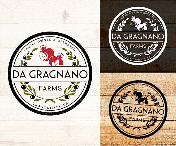
Challenge:
Create an identity for California olive and pomegranate farm, Da Gragnano Farms.
Solution:
Design a modernized rustic, stamp-style logo using an olive wreath filled with pomegranates.
Results:
Farm has successfully launched organic pomegranate business. Olive trees are currently developing.
Contributions:
Identity creation.
Challenge:
Create an identity for local Chicago bar, Scarlet, based on their signature scarlet-colored chandelier, symbolic of early 1900's gay culture where gay men would wear small scarlet wristbands to identify themselves with other gay men in an act of both safety and community.
Solutions:
Results:
Scarlet continues to use identity, and has been successful for over 8 years.
Contributions:
Identity creation.
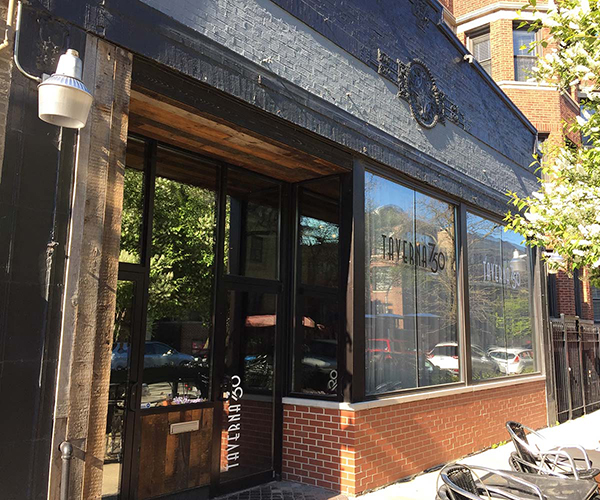
Challenge:
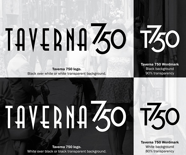
Create an identity for local Chicago restaurant, Taverna 750, based on 1930’s and 1940’s French fashion.
Solutions:
Results:
Taverna continues to use identity, and has been successful for over 5 years.
Contributions:
Identity creation, truncated identity creation.